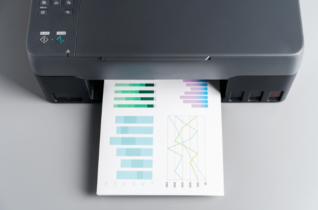
Print colours vs Screen colours
When it comes to designing for both print and digital platforms, understanding the difference between RGB vs CMYK colour models is crucial. The main distinction lies in the colour models used: RGB for screens and CMYK for print. Let’s delve into how each model works and why it matters for your design projects.
RGB vs CMYK: The Basics
RGB stands for Red, Green, and Blue. This model is used for digital screens, such as computers, televisions, and smartphones. Screens use light to display colours, and RGB combines different intensities of these three colours to create the full spectrum. When all three colours are combined at their highest intensity, they create white.
On the other hand, CMYK stands for Cyan, Magenta, Yellow, and Key (Black). This model is used for printing. Unlike RGB, which uses light, CMYK is a subtractive model that uses ink. When combined, these inks absorb light to produce colours. Mixing all four results in a rich, deep black.
Differences in Colour Representation
One of the significant differences between RGB vs CMYK is how they represent colours. RGB can produce a wider range of colours than CMYK, which means some vibrant colours you see on your screen might not be accurately reproduced in print. This is why you might notice a difference in colour intensity between your digital designs and their printed counterparts.
Why the Right Colour Model Matters
Choosing the right colour model is essential for ensuring your designs look their best in their intended format. For digital designs, RGB is the way to go. It allows you to take full advantage of the vibrant colour range that screens can display. However, when preparing designs for print, it’s crucial to switch to CMYK. This ensures that the colours in your print material will closely match what you intended, minimizing surprises.
Tips for Designers
- Convert Early: Start by designing in the correct colour mode. If your project is intended for print, set your software to CMYK from the beginning. This helps avoid any issues that might arise from converting colours later.
- Use Soft Proofing: Most design software offers a ‘soft proofing’ feature that simulates how your design will look when printed. Use this to check how your colours will appear in CMYK.
- Test Prints: Before finalizing your print design, consider ordering test prints. This allows you to see how colours will look on paper, enabling you to make necessary adjustments.
- Communicate with Printers: Have a conversation with your printer about colour expectations. They can provide guidance on achieving the best possible results for your print project.
In conclusion, understanding the differences between print colours and screen colours is key to creating designs that are visually consistent across different media. By using the appropriate colour models and techniques, you can ensure your designs look their best, whether they’re on a screen or in print.


